
Built case study
Artisan Kuliner Group
One group identity that lets ten culinary brands read as a single house without flattening their individual marks.
- Duration
- —
- Stack
- —
- Handover
- Pending
Built case study
One group identity that lets ten culinary brands read as a single house without flattening their individual marks.
Chapter 01
Artisan Kuliner Group needed one public presence for a portfolio of restaurants and food brands. The page opens with the group mark and a single brand statement, then gives the visitor a way into the portfolio, the news, and the story behind the company.

Select a numbered pin to read the decision behind it.
The Artisan lockup and the individual BAKERMAN+ wordmark share the opening screen. The parent brand is present without replacing the restaurant identity.
The hero is a sentence about curiosity and experience, not a product grid. It gives the portfolio a point of view before showing the individual brands.
The location sits below the statement in plain text. The page can be read as a profile and as a place to visit.
Chapter 02
Each brand brings its own colour, wordmark, and type treatment. The portfolio grid has to hold them together without recolouring the marks or forcing them into identical cards. The solution is a fixed tile rhythm with the brand’s own field colour inside each tile.
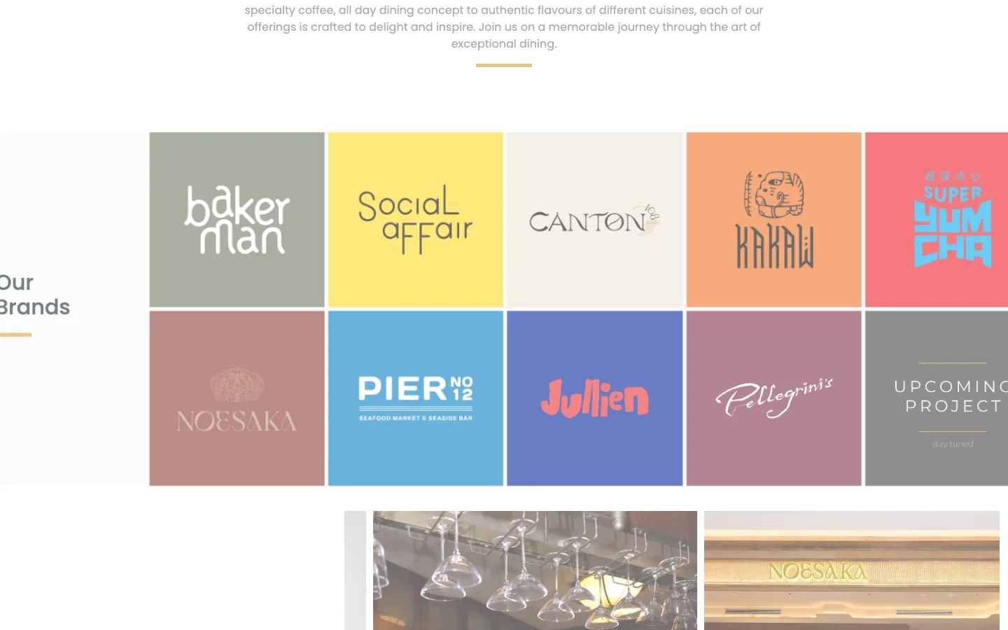
Select a numbered pin to read the decision behind it.
Equal tiles let the eye compare ten brands quickly. The grid provides structure while each mark keeps its own palette.
Brand colours and wordmarks remain in their own fields. The page supplies the frame, not a new visual identity for every restaurant.
The empty upcoming-project tile keeps the grid complete while making the portfolio feel like it is still growing.
Chapter 03
Below the portfolio, the page moves into news cards and an about section. The same type scale and rule lines carry the transition, so a visitor can move from brand browsing to company context without a change in voice.
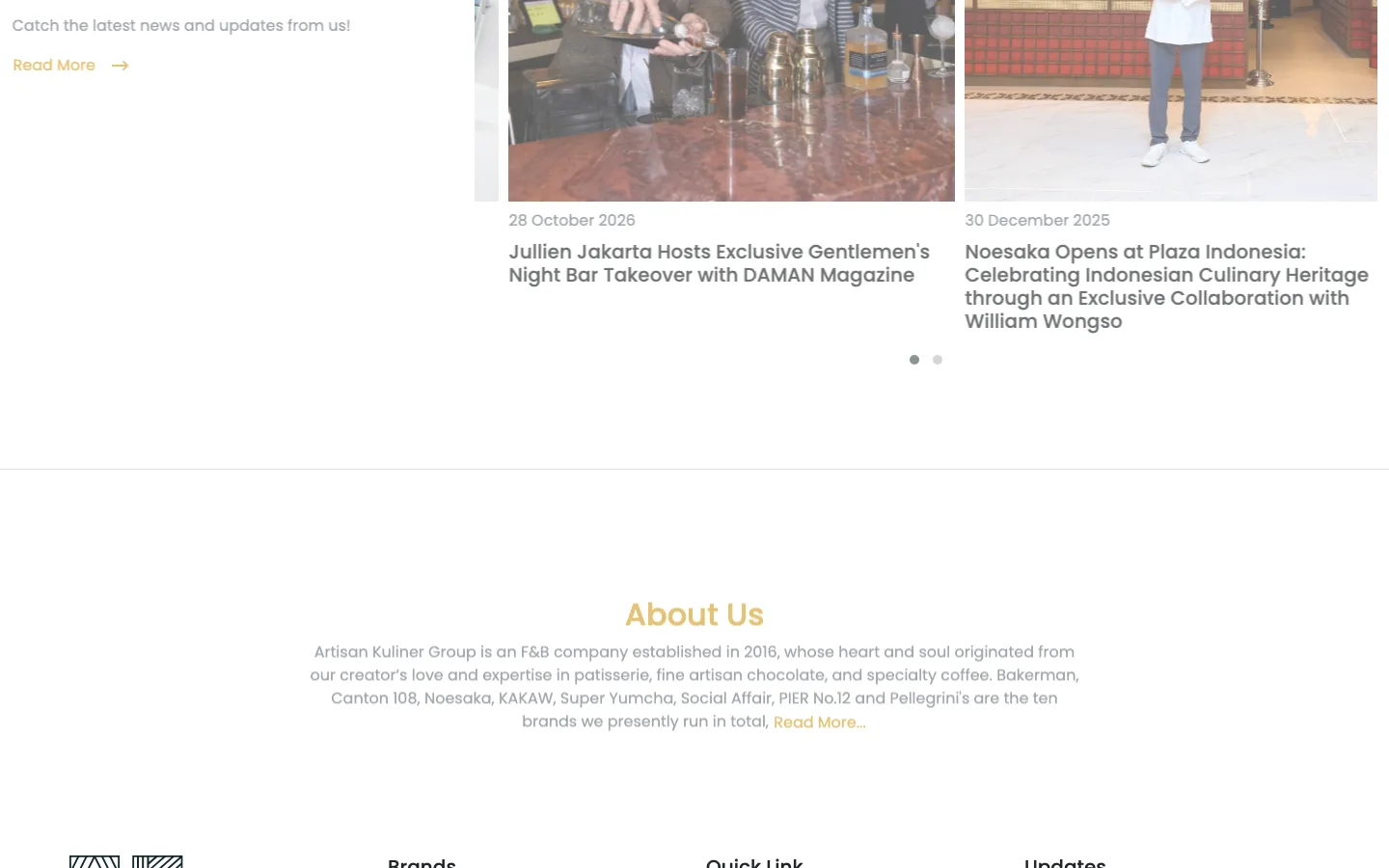
Select a numbered pin to read the decision behind it.
Photography, date, and headline share one card. The section reads as a publication rather than a set of promotional tiles.
The copy lists the group’s brands and its origin in one paragraph. It gives the grid a company behind it.
The identity returns at the end of the page, closing the profile with the same lockup that opened it.
Chapter 04
The review pass asks whether every mark still reads at tile size, whether adjacent colours stay distinct, and whether the page has a clear route from the group story to an individual brand. The grid is the proof surface: if a tile only works at full size, the portfolio is not finished.
Chapter 05
The project note describes the result as a single group presence rather than a directory of restaurants. No traffic number or timeline is attached to this illustrative build.
“A group profile that makes ten culinary brands feel like one house.”
Chapter 06
This page is a public presentation of the build, not a client handover record. Repository, deployment ownership, secrets, documentation, and runbook evidence stay pending until they are attached to the project.
Delivery proof
No repository transfer record is published for this illustrative build.
The project record links to a public site. Deployment ownership and access evidence are not recorded here.
No handover documentation is attached to the public project record.
No secret-clearing record is attached to the public project record.
No runbook is attached to the public project record.
Illustrative build. This is not a client handover record; every item stays pending until evidence is attached.
Next
Send a brief, review staging once, and verify the handover. The studio handles the rest.