
Built case study
Komikmanga
A reading catalogue that keeps discovery dense on desktop and legible on a phone, without splitting the library into two products.
- Duration
- —
- Stack
- —
- Handover
- Pending
Built case study
A reading catalogue that keeps discovery dense on desktop and legible on a phone, without splitting the library into two products.
Chapter 01
The first screen has one job: put something readable in front of a visitor before they decide to search. The page leads with a ranked feature, follows with a compact top-three list, and keeps recent updates one step below. The mobile version keeps the same order; only the card geometry changes.

Select a numbered pin to read the decision behind it.
Cover art, chapter count, running status, view count, and a direct Read control sit in one block. A visitor can start reading without opening a detail page first.
Three numbered titles repeat the same information shape as the feature, so the eye can compare them without learning a second layout.
The numbered row below continues the count from four upward. It gives the page more inventory without turning the first screen into an endless grid.
Chapter 02
The narrow view cannot simply shrink the desktop grid. Covers, ranking numbers, status labels, and the read action all compete for the same width. The mobile layout keeps the feature card large, moves the secondary titles into a two-column stack, and holds the primary destinations in a bottom bar.

Select a numbered pin to read the decision behind it.
The brand, locale, search, and theme controls stay compact enough that the first title still appears in the first viewport.
The cover is still the main visual, but the title, chapter number, and Read button stack vertically so the tap target is never squeezed.
Five destinations are labeled in text and marked with icons. The current section is not communicated by colour alone.
Chapter 03
The latest-updates surface repeats one card for every title: cover, title, status, view count, and three recent chapters with relative times. The card is designed as a repeatable unit so a new chapter does not require a new layout decision.
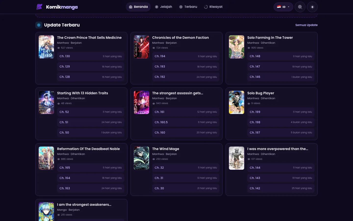
Select a numbered pin to read the decision behind it.
The card shows the title and its three most recent chapters together. The repeated row height makes the list scannable even when titles wrap.
Decimal chapters and long titles do not push the number out of alignment. The number stays the anchor for a returning reader.
Each chapter row says how long ago it changed. The label is text, so the update state does not depend on colour or an unlabeled icon.
Chapter 04
The review surface is the update card. Long titles, decimal chapter numbers, stopped and running statuses, and relative dates all share the same width. The rule is simple: a card must still read when the title wraps to two lines, and the status must remain available as text.
Chapter 05
The project note describes the result in the reader’s terms rather than a usage metric. No traffic number or timeline is attached to this illustrative build.
“A reading site that stays fast on a phone and keeps the latest chapters easy to find.”
Chapter 06
This page is a public presentation of the build, not a client handover record. Repository, deployment ownership, secrets, documentation, and runbook evidence stay pending until they are attached to the project.
Delivery proof
No repository transfer record is published for this illustrative build.
The project record links to a public site. Deployment ownership and access evidence are not recorded here.
No handover documentation is attached to the public project record.
No secret-clearing record is attached to the public project record.
No runbook is attached to the public project record.
Illustrative build. This is not a client handover record; every item stays pending until evidence is attached.
Next
Send a brief, review staging once, and verify the handover. The studio handles the rest.